Increasing Conversions by 100% via Highly Usable Interfaces
Redesigning Long & Foster
My Roles
Principal UX Designer, Information Architect, Wireframer, Prototyper, Strategic Support
Collaboration
Worked closely with Senior Developers, Senior Visual Designer, Accounts, and Client. Helped to manage Developers, keeping to schedule and working within requirements
The Challenge
Our task: Design a modern web experience for buyers, sellers, agents, community members, and, of course, for the business. Steps: Do the research, take apart the whole site, re-structure it, redo the UX, introduce components, rewrite the content, redesign the site visually — all while updating the overall brand as well. Working as part of a small team within RP3 Agency, I was the UX lead and also filled many other roles on this complete overhaul of the Long & Foster site.
Approach

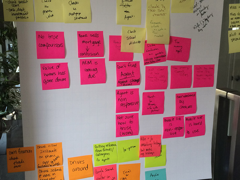
We were grateful to have significant time to conduct qualitative research, interviewing people both internal and external. Making mind maps helped our team to begin making connections between coded subjects.

We created customer journeys and personas to get inside the mindset of each audience.

Design debt woes: Outdated and non-responsive, the existing site at this point was not solving the goals that users have, e.g. finding houses, learning about homebuying and selling, prioritizing features, and talking with agents and staff. We had a clear starting point, but we also had the flexibility to redesign the entire web presence.

Probably the most intensive and longest IA phase I've ever worked on, this step entailed card sorts, site inventory, many brainstorms, and meetings. I was taking copious notes on rough drafts over several weeks.

Making reusable components such as a property listing tile involved analyzing both the user goals and existing patterns to create a simple, highly usable block with meaningful and balanced visual priority.

Another example of a component: the agent card, which is customizable and flexible enough for a massive variety of data -- about 10,000 agents.
Working with Developers

We worked in Agile sprints, designing and submitting components and templates every two weeks, then revising and iterating on them. In addition to using Trello and Jira, we sometimes utilized whiteboards for quick assignments.
At this point, we had conducted user testing, and I was in charge of fixing usability bugs, the largest being a menu system which users struggled with.

One of the issues (of many) we encountered was a data feed of neighborhood names in all caps. I wrote a regex Codepen to show our developers how I envisioned transforming it into initial caps. View the Codepen.
Results
Conversions increased by 100%! The brand-new site hugely succeeded in all major business goals, and we also heard postitive feedback from the agents themselves.


Accolades: We won a W3 prize for UX!
More Work
THINK TANK
Leveraging User Research to Help Clients Make DecisionsWe employed tree testing to provide evidence of the most effective new I.A. for a client's site.
HEALTHCARE
Creating a better ZIP code search for patientsWhen patients search for a doctor, using their ZIP code, is a centerpoint based on a bounding box really the best approach?
NONPROFIT
Helping parents and teens evaluate sports for their childrenHow do people know which sports may be most beneficial for their teenagers to play? And how might they customize rankings based on what is important to them or their family members?

